

Industry
Performance
Rankings
Quickly Identify the Best and Worst Performing Industries
See which industries are delivering real returns and which ones are lagging. Relative performance rankings across multiple timeframes. One clean, sortable dashboard.
Instant clarity on top and bottom performing sectors so you can rotate into strength and avoid weakness faster.

What You Get
One sortable dashboard of 100+ industries with daily performance updates

Multi-timeframe returns (5D, 20D, 50D, 200D, and YTD)

Relative performance rankings vs the market and peer industries

One-click refresh keeps performance data current. Built to work alongside Watchlist Summary and Industry Strength Rankings.

Clear identification of top and bottom performing industries

Fully sortable and color-coded for fast decisions

Export your watchlist + save personal templates

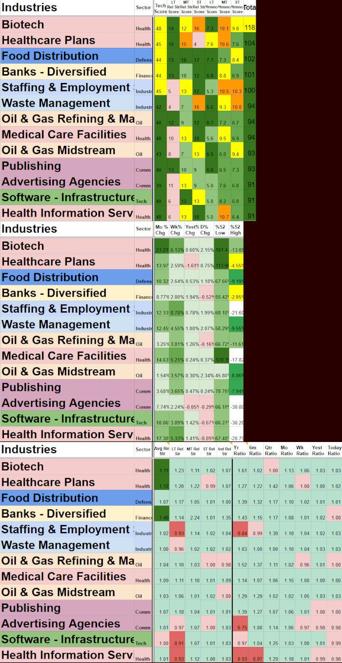
How Industry Performance Rankings Works
Most traders look at individual stocks or broad market indexes and miss the important layer in between — how entire industries are actually performing relative to each other and the market.
What the rankings measure:
The tool calculates multiple layers of performance data for each industry. It combines:
Performance Scores (Long-term, Medium-term, and Short-term) that measure returns across different time horizons.
Relative Strength Scores (LT, MT, and ST) that show how each industry is performing compared to the broader market and its peers.
Multiple Time Frame % Changes to show whether an industry is near extremes.
Multiple relative strength ratios across different timeframes (Year, 6m, Quarter, Month, Week, Yesterday, Today) plus industry-specific relative strength comparisons.
These layers are combined into clear, sortable rankings so you can quickly see which industries are leading or lagging on both an absolute and relative basis.
Key signals it surfaces:
Top and bottom performing industries across multiple timeframes (Current, Yesterday, Weekly, Monthly)
Industries showing strong or weakening relative strength compared to the market
Momentum shifts (industries moving up or down the performance rankings)
Industries near 52-week highs or lows
Whether recent performance is supported by relative strength
Fully sortable with color coding for fast visual clarity. One-click refresh keeps everything current. Designed to work alongside both Watchlist Summary and Industry Strength Rankings so you can combine performance data with participation and fundamental strength when making decisions.
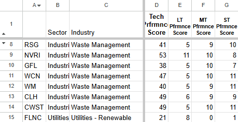
Industry Price and Return Data
↓

Performance Scoring Engine
↓

Industry Performance Rankings
Real Edge in Action: How Traders Use Industry Performance Rankings
Real Trading Scenarios. Real Decisions.
Right Now
Finding the strongest performing industries
Scenario:
You want to focus your attention on sectors that are actually delivering returns instead of guessing or following narratives.
How IPR Helps:
Sort the dashboard by LT Performance Score MT Performance Score and ST Performance Score. The industries ranked at the top are currently showing the strongest relative performance over those timeframes. This lets you immediately see where the market is rewarding strength.
Key benefit:
Quickly focus on sectors showing real performance instead of wasting time on underperforming areas of the market.
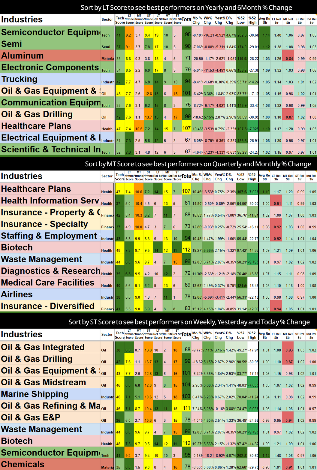
Sort by weakest Month % Change and see the highest Weekly % Change to see who is turning up.
Spotting momentum shifts
before they become obvious
Scenario:
An industry has been lagging but you notice it starting to improve. You want to catch the rotation early instead of waiting for price to make it obvious.
How IPR Helps:
Sort by recent performance and look for industries that are moving up the rankings quickly. These momentum shifts often appear in the performance data before they show up clearly in individual stocks.
Key benefit:
Get ahead of sector rotations by seeing which industries are improving in relative performance.
Avoiding the weakest
performing industries
Scenario:
You want to reduce exposure to sectors that are consistently underperforming the market and peers.
How IPR Helps:
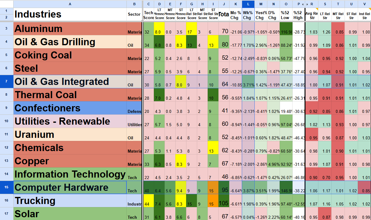
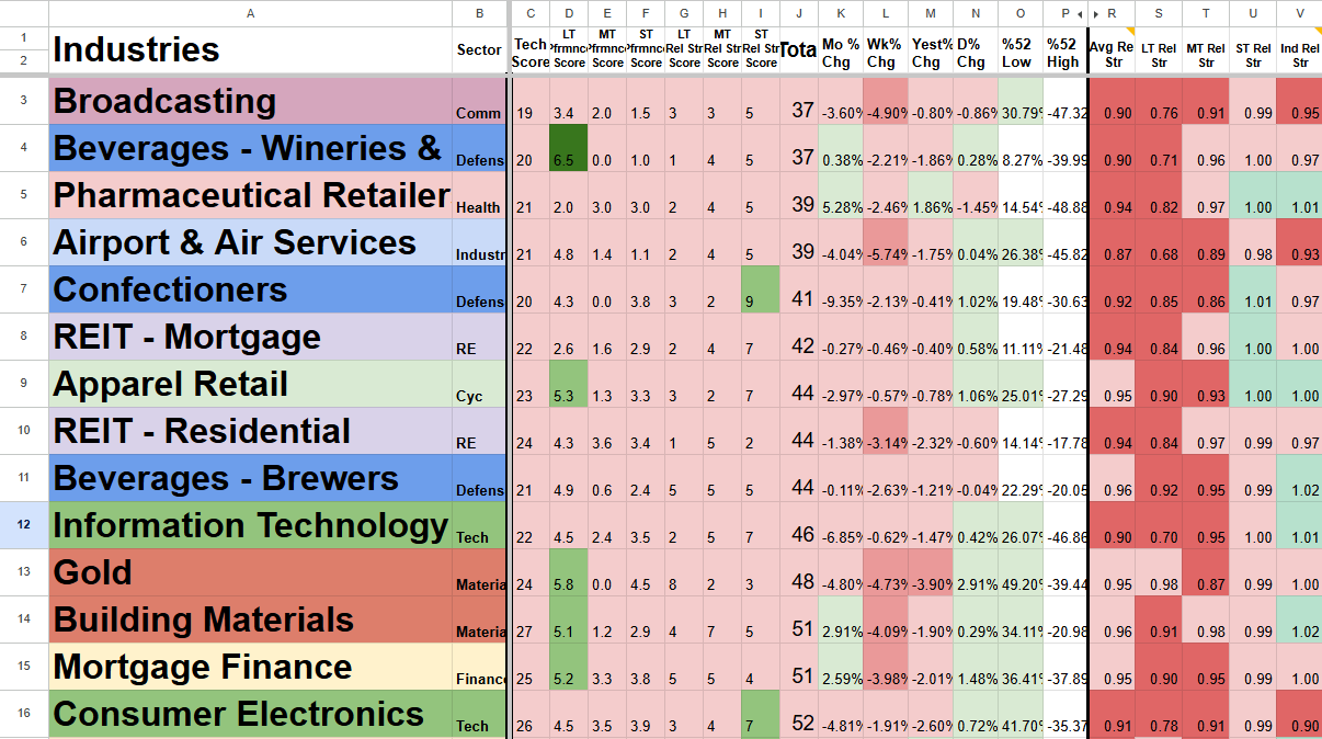
Sort by lowest performance rankings across your chosen timeframe. Industries consistently at the bottom with poor relative performance are often the ones to avoid or reduce. This gives you a clear, data-backed reason to stay away.
Key benefit:
Protect capital by systematically avoiding the weakest areas of the market instead of holding them too long.
Sort by lowest total score to see worst performing industries across all time frames.
Combining performance
with strength for
higher conviction trades
Scenario:
You’ve identified an industry with strong breadth and participation (using Industry Strength Rankings), but you want to confirm it’s also showing good recent performance before adding exposure.
How IPR Helps:
Compare the same industry across ST Performance Score, MT Performance Score, and LT Performance Score. When performance is strong across multiple timeframes, you have more confidence. When short-term strength is not supported by longer-term scores, you can be more cautious.
Key benefit:
Make more confident decisions by seeing performance consistency across short-term, medium-term, and long-term timeframes instead of reacting only to the most recent move.
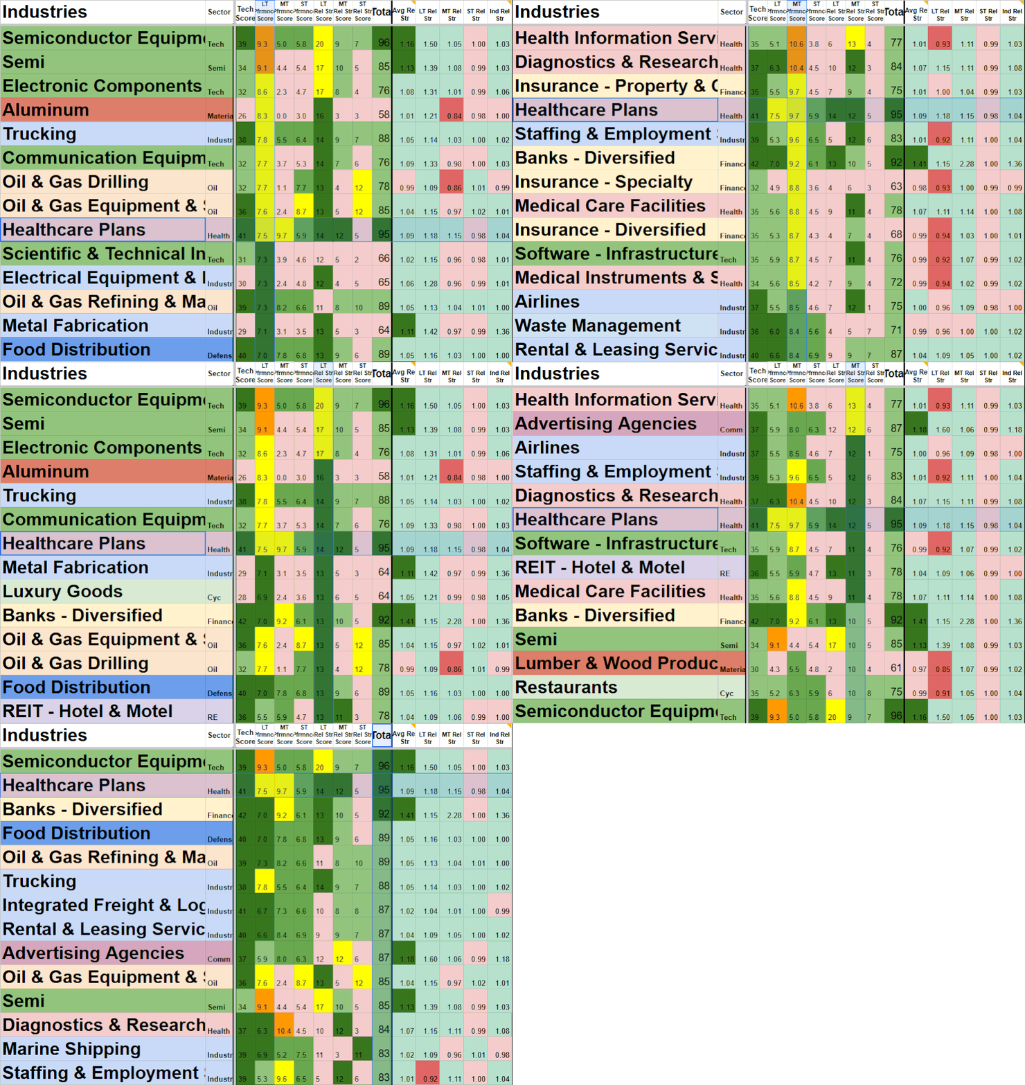
Industries that appear in multiple filters and sorts are the ones to avoid or the strongest.
Setup & Getting Started
Once you subscribe, you’ll receive an instant email with your personal copy of the Industry Performance Rankings template and simple setup instructions.
Getting started takes 2–3 minutes:
Make a copy of the template (one click).
Open the Rankings tab.
Click the Refresh Rankings button to load the latest performance data.
Grant permissions when prompted (one-time step).
After the first refresh, your sheet will be fully populated with relative performance rankings across multiple timeframes for 100+ industries.
Need help? Just reply to the welcome email or contact admin@stockscore.systems.
FAQ
-
Performance rankings updates live. The one-click refresh pulls the latest return data across all tracked timeframes.
-
No. Everything runs in Google Sheets with your own personal template. You only need a free Google account.
-
You’ll get an instant email with a link to make your own personal copy of the template plus setup instructions (2–3 minutes).
-
Industry Strength Rankings focuses on participation, breadth, and fundamental support. Industry Performance Rankings focuses purely on relative returns and momentum across timeframes. Many traders use both together.
-
Yes. Industry Performance Rankings is included in the Research and Pro bundles at a discounted price.
-
Just reply to the welcome email or contact admin@stockscore.systems. I personally help users get set up quickly if they run into any issues.
Stop Guessing Which Industries Are Performing
Quickly see the best and worst performing industries with clear relative rankings across multiple timeframes. Focus only on sectors delivering real returns and avoid the ones quietly lagging. Combine performance data with strength signals for higher conviction decisions.
Used daily by active traders who want to make faster, smarter rotation moves and protect their capital.