

Watchlist
Summary
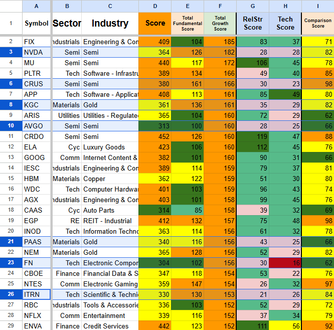
Your Daily Command Center for 2,200+ Stocks
One clean, sortable dashboard with transparent scoring, peer comparisons, and one-click refresh.

What You Get
One sortable dashboard with 2,200+ stocks and live updates

Composite scoring across Fundamentals, Growth, Technicals & Relative Strength

Built-in sector and industry peer comparisons

One-click refresh — always current with the latest data

Quick Filter Tab - Filter out the noise, set min and max to focus

Clear color-coded rankings (Top 1%, 5%, 10%, 25%)

Export your watchlist + save personal templates

How Scoring Works
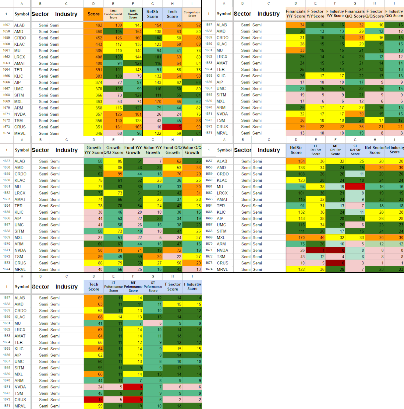
Every score in the Watchlist Summary is built using clear, rules-based calculations — not opinions or guesses. The methodology is fully transparent so you can understand exactly what each number represents and how it’s derived.
Fundamental Score
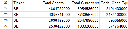
The Fundamentals Score shows how financially healthy a stock is based on its most recent reported data. It evaluates dozens of key metrics — including revenue, operating income, cash flow, earnings, ROIC, profit margins, valuation ratios, and debt levels — on both a quarter-over-quarter and trailing twelve-month (TTM) basis.
Each metric is measured in three ways:
On the company’s own latest results (QoQ and TTM)
In direct comparison to its sector average
In direct comparison to its industry average
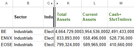
This gives you a clear, well-rounded view of whether a stock is fundamentally strong on its own and how it stacks up against its peers. The final Fundamental Score is the result of serious filtering across dozens of data points — not just a handful of surface-level numbers.
All underlying financial data comes from official sources, including NASDAQ. The Watchlist Summary sits on top of this data as the final presentation layer.
Raw Financial Data
↓
Multi-Layer Scoring Engine
↓

Watchlist Summary
Growth Score
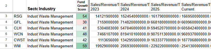
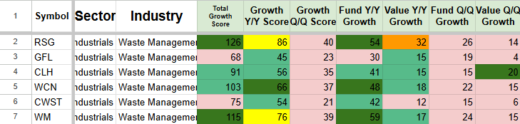
The Growth Score measures how meaningfully a stock is growing by tracking year-over-year and quarter-over-quarter changes across key financial metrics. It evaluates growth in revenue, operating income, earnings, and cash flow, along with valuation trends over multiple years.
Growth is evaluated both on the stock’s own merits and in direct comparison to its sector and industry averages. This score doesn’t just measure whether a company is growing — it also measures how much it’s growing relative to its peers.
Companies that show strong, sustained growth across both short-term and longer-term periods tend to stand out as higher-quality opportunities. The Growth Score highlights stocks that aren’t just growing, but growing meaningfully compared to their competition.
Relative Strength
& Technical Score
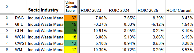
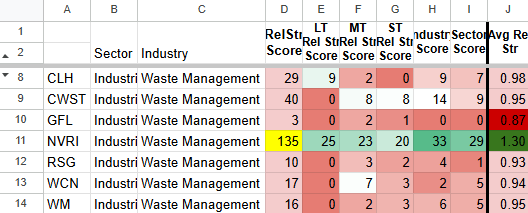
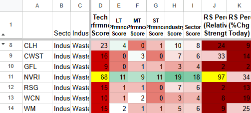
The Relative Strength & Technical Score measures a stock’s momentum and performance relative to the broader market and its peers. It combines two key signals:
Relative Strength: How a stock has performed compared to major benchmarks (SPY and QQQ), its own sector, and its industry across multiple timeframes.
Technical Performance: Percentage gains across several defined timeframes, with points awarded when stocks meet specific performance thresholds.
This score helps identify whether a stock has genuine momentum or is simply moving with broader market noise — and how it truly ranks relative to its peers.
Quick Filter — Cut the noise in seconds
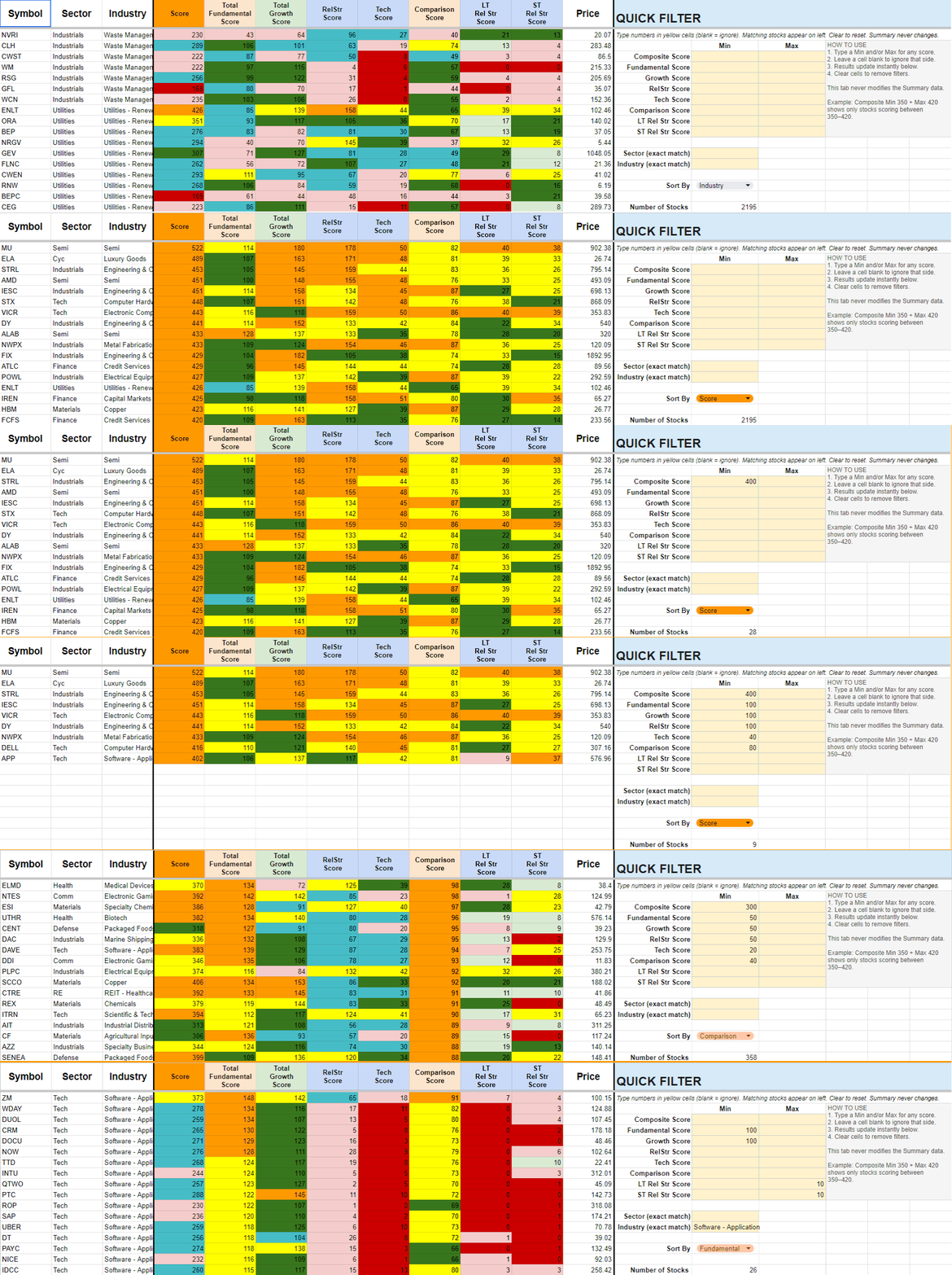
The Summary tab shows every stock. The Quick Filter tab lets you set min/max thresholds on any score + Sector or Industry, then instantly reduces 2,300+ rows to a focused watchlist.
Original data stays completely untouched. Clear the yellow cells anytime to restore the full list.
Real Edge in Action: How Traders Use Watchlist Summary
Real Trading Scenarios. Real Decisions.
Scenario:
You see semiconductors surging and want to know if there’s still opportunity — or if you’re already too late.
How Watchlist Summary Helps:
Sort the industry by Fundamental Score to see which stocks have real earnings support. Then check Relative Strength and Technical Score to see which names are still leading and which have already run too far.
This turns a stressful “should I chase?” moment into a clear, data-backed decision.
Semis are ripping. Am I too late?
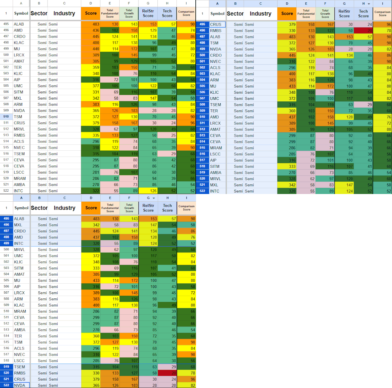
Sort by Relative Strength ↓

→
→
→
→
Spot the lowest Fundamental and Growth Scores
Industry has been HOT for too long.
Should I avoid it or even short it?
Scenario:
You’ve watched an industry run hard for months and you’re starting to wonder if it’s overextended. You want to find the most hyped names — the ones most likely to pull back or offer short opportunities.
How Watchlist Summary Helps:
Sort by highest Relative Strength Score to surface the most extended names. Then check Fundamental Score and Comparison Score to identify which of those leaders have the weakest underlying fundamentals.
This gives you a clear way to spot the most overextended and vulnerable names in a hot industry — instead of guessing or avoiding the whole sector.
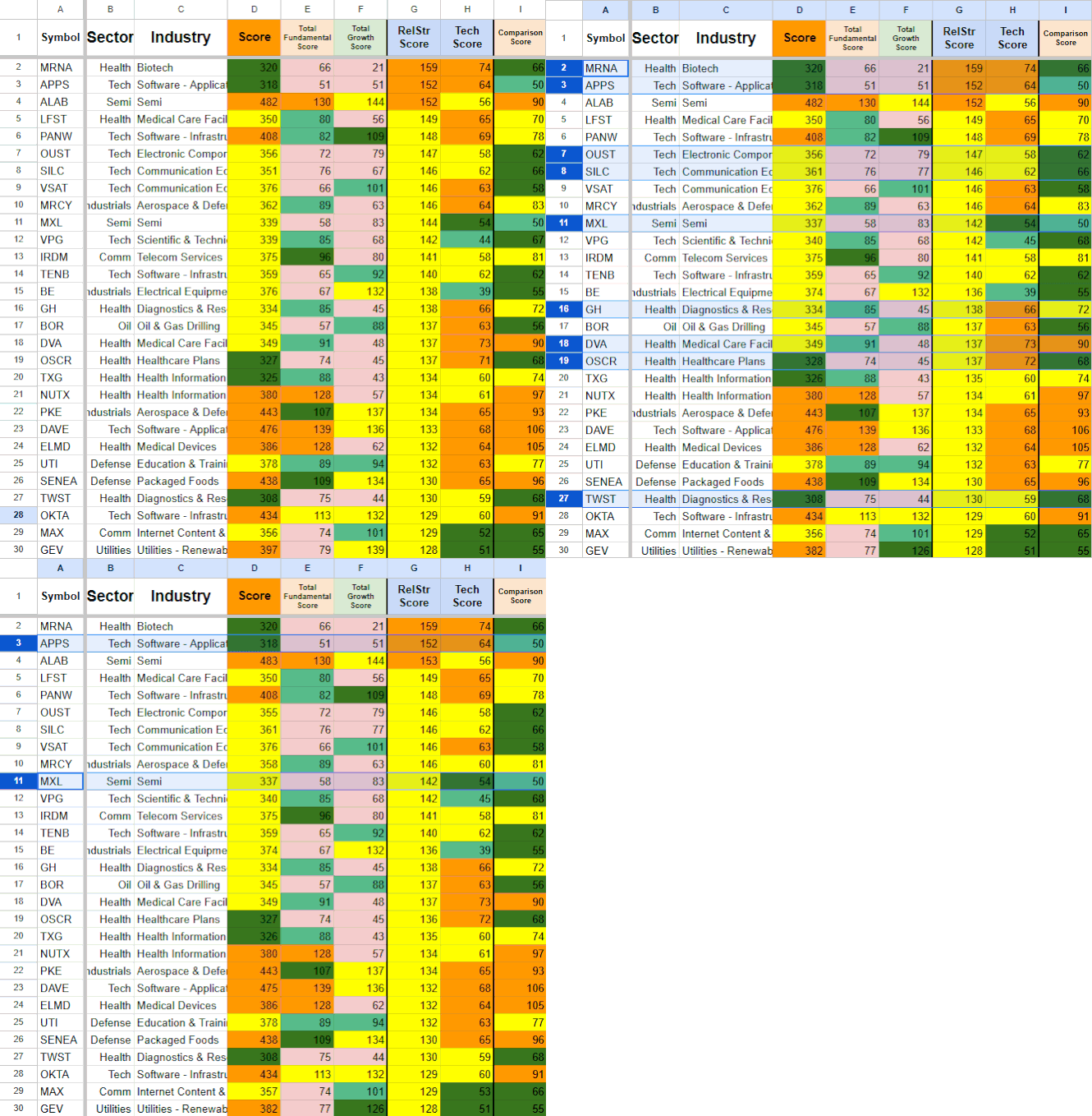
Sort by Fundamental Score ↓
Sort by Relative Strength Score ↑ Spot the outliers.
Lowest Comparison Scores = worst vs peers ↑
I want to buy strong stocks on pullbacks,
but only if the fundamentals still support it.
Scenario:
You see a stock you like pull back and you’re interested in buying the dip — but you want to make sure the fundamentals are still solid and it’s not a value trap.
How Watchlist Summary Helps:
Sort by Relative Strength to quickly surface names that have pulled back recently. Then check the Fundamental Score on those names to see which ones still have strong underlying earnings and financial health despite the weakness.
This helps you separate real buying opportunities from stocks that are weak for a reason.
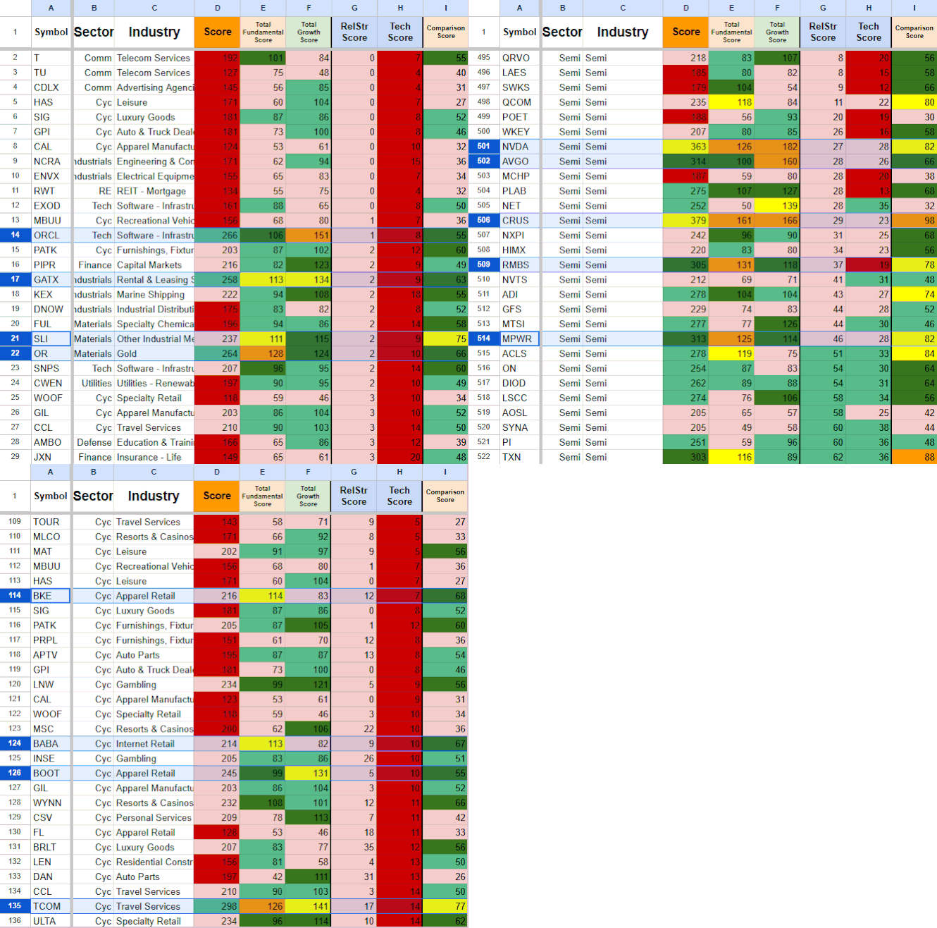
Strong Fundamentals + Recent Pullback = Potential Opportunity
Want to find the fastest growth stocks
Scenario:
You want to find companies that are growing very fast, but you don’t want to chase names that have already run up a lot in price. You’re looking for high-growth stocks that the market hasn’t fully noticed or priced in yet.
How Watchlist Summary Helps:
Sort by the highest Growth Score to surface the fastest growers. Then look at Relative Strength and Performance Scores to find which of those names still have relatively weak price action.
This gives you a clear way to identify high-growth names with real potential before they become obvious to everyone else.
before the market catches up?
High Growth
+
Low Rel Str
=
Undiscovered
Opportunity
Sort by Highest Growth Score ↓
Spot the names with low Relative Strength / Tech Score ↑ ↑
Setup & Getting Started
Once you subscribe, you’ll receive an instant email with your personal copy of the Watchlist Summary template and simple setup instructions.
Getting started takes just 2–3 minutes:
Make a copy of the template (one click).
Open the Summary tab.
Click the Refresh Data button to load the latest scores.
Grant permissions when prompted (one-time step).
After the first refresh, your sheet will be fully populated with up-to-date scores across Fundamentals, Growth, Technicals, and Relative Strength. You’ll see two main tabs: Summary (full list) and Quick Filter (your focused shortlist workspace).
If you run into any issues during setup, just reply to the email or reach out to admin@stockscore.systems
FAQ
-
Technical and Relative Strength data updates live. Fundamental data is updated when the main data sources are refreshed. All scores are instantly transferred to your Watchlist Summary with one click using the built-in Refresh button. Most users refresh once per day before starting their analysis.
-
No. The Watchlist Summary runs entirely in Google Sheets. All you need is a free Google account. The email you use at checkout must match the Google account you open the sheet with.
-
You’ll receive an instant email with a link to make your own personal copy of the template, along with simple setup instructions (takes 2–3 minutes). Your email must be added as a viewer on the sheet for the Refresh button to work properly.
-
Yes. The Watchlist Summary is included in the Performance, Research, and Pro bundles at a discounted price.
-
Just reply to the welcome email or contact admin@stockscore.systems. I personally help users get set up quickly if they run into any issues.
Turn Raw Data Into Your Daily Trading Edge
Get everything you need — Fundamentals, Growth, Technicals, Relative Strength, and peer comparisons — in one clean, sortable dashboard.
Used daily by active traders who want faster, more confident decisions without the noise.