

Industry
Strength
Rankings
Know Where Strength is Concentrated.
Stop Chasing Industries That Look Strong But Aren’t
See which industries actually have real participation and momentum behind them — and which ones are quietly weakening. Positive vs Negative Strength Scores. Multi-timeframe breakout alerts. One clean dashboard.
Instantly know where the real money is rotating so you can focus only on the strongest industries before you pick stocks.

What You Get
One sortable dashboard of 100+ industries with daily updates

Positive Strength Score (bullish breadth + momentum) vs Negative Score (bearish pressure)

Multi-timeframe relative strength across 5D, 20D, 50D, 200D, and 365D

One-click refresh — always current with the latest data

Clear breakout and breakdown alerts with new high/low highlights

Fully sortable and color-coded for instant decisions

Export your view + save personal templates

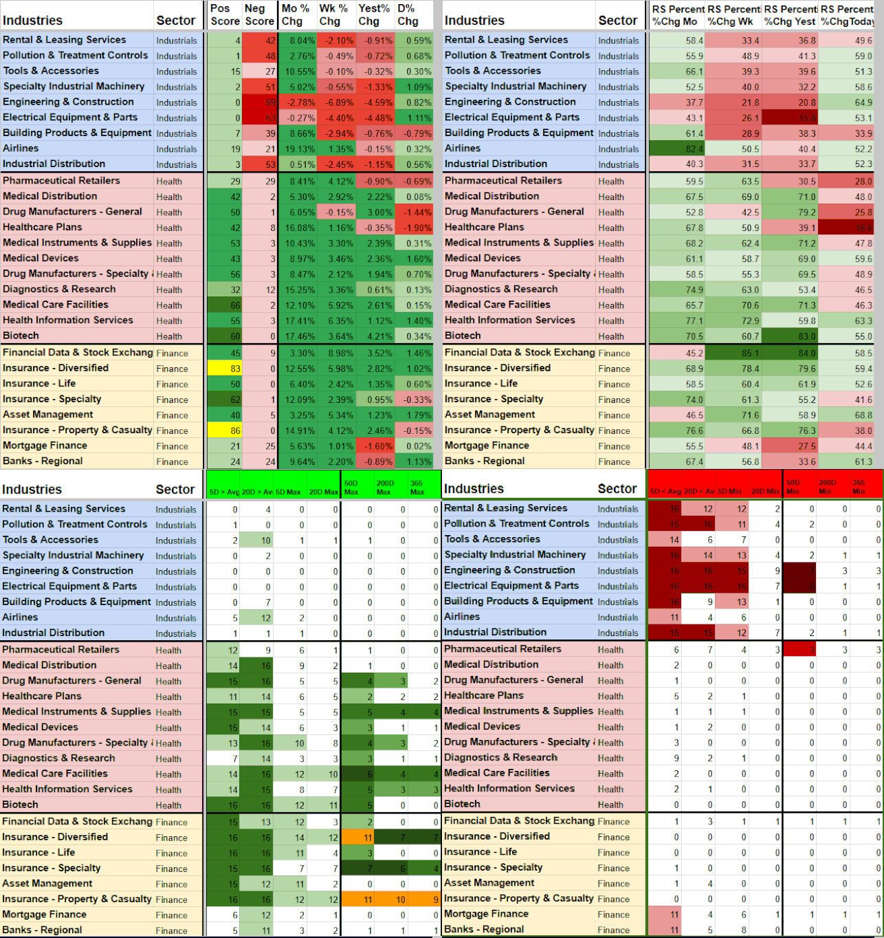
How Industry Strength Rankings Works
Most traders look at a single percentage move or a headline and assume an industry is strong. ISR goes deeper. It shows whether that strength has real participation behind it and how it stacks up across multiple timeframes.
What the scores actually measure:
The tool calculates industry-level scores directly from the individual stocks inside each sector. It awards positive points when an industry beats its 5-day or 20-day average and negative points when it falls below. Extra points are given for hitting new highs or lows on the 20D, 50D, and 365D timeframes. It also factors in relative strength and breadth/participation data.
Key signals it surfaces:
Industries hitting new highs or breaking above short-term averages across 5D, 20D, 50D, 200D, and 365D
Whether strength is broad (many stocks participating) or narrow
Early signs of real breakouts vs false breakouts
Clear Positive Strength Score (bullish breadth + momentum) versus Negative Score (bearish breadth + momentum)
Color Coding (instant visual clarity):
Light green — Strength improved from yesterday
Dark green (5D/20D) — At or near maximum strength
Dark green (50D/200D/365D)— 4+ new highs or strong longer-term participation
Orange (50D/200D/365D) — Extreme moves (half the possible points at all-time highs or lows)
Fully sortable. One-click refresh. Designed to work alongside Watchlist Summary so you can quickly move from strong industries down to the best stocks inside them.
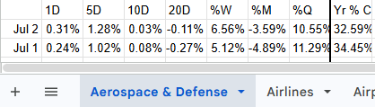
Industry Data from Stocks
↓
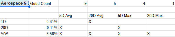
Positive and Negative Scoring Engine
↓

Industry Strength Rankings
Real Edge in Action: How Traders Use Industry Strength Rankings
Real Trading Scenarios. Real Decisions.
vs false breakout
Confirming real industry strength
Scenario:
You see an industry ripping higher with a strong narrative, but you’re not sure if it has real breadth behind the move or if it’s just a few big names carrying everything. Chasing it feels risky — you’ve been burned by narrow breakouts before.
How ISR Helps:
Sort by Positive Strength Score and check the Participation and new high columns across the 5D, 20D, 50D, 200D and, 365D timeframes. Strong breadth + multiple new highs = real institutional flow. Weak or narrowing participation while price is still rising = stay away or treat it as stock-specific only.
Key benefit:
Stop chasing industries that are about to stall and only commit when breadth confirms the strength is real.
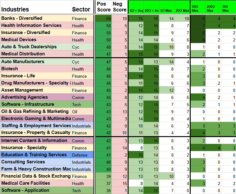
Sort each timeframe % Change to see middle of the pack
↓
Spotting early rotation into
the next strengthening industry
Scenario:
You want to get positioned in the next wave of strength before it becomes obvious and crowded. By the time most traders notice a sector or industry is “hot,” a lot of the easy move has already happened.
How ISR Helps:
Filter for industries showing improving Positive Strength Scores and rising participation, even if they’re still mid-pack in the rankings. Focus on those also printing new highs on the 20D or 50D. These are the industries where money is rotating in early, before price makes it obvious to the crowd.
Key benefit:
Get positioned in the next rotation plays while they’re still early, instead of chasing after everyone else has already piled in.
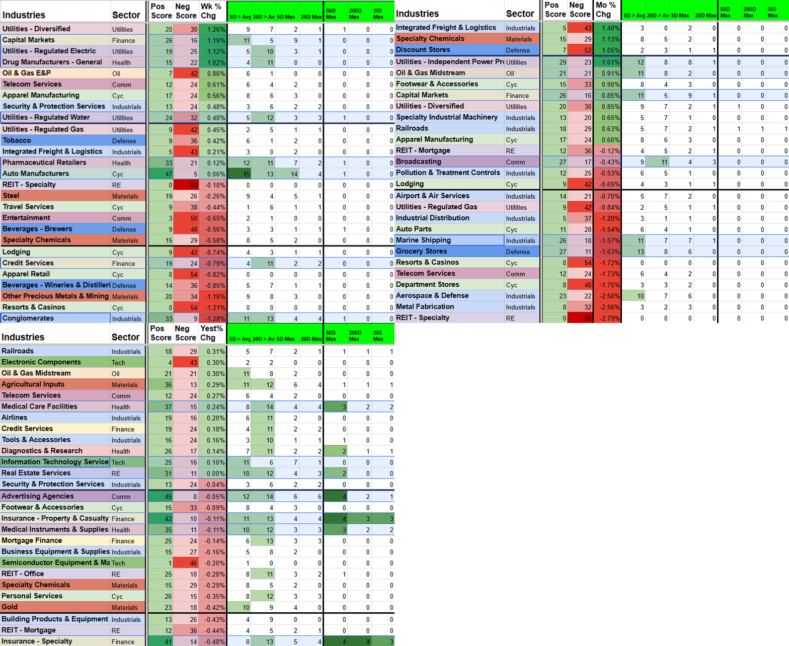
More Green = Stronger
Avoiding weakening industries
before the damage shows up in your stocks
Scenario:
An industry has been strong for months. The stocks inside it still look decent, but something feels off. You’ve held positions like this before and watched them slowly roll over while you kept telling yourself it was “just a pause.”
How ISR Helps:
Sort by Negative Strength Score or filter for industries dropping below their 5D/20D averages with declining participation. Watch for the color shift toward red. Rising Negative Score + falling participation is often the earliest reliable warning to reduce exposure.
Key benefit:
Protect gains by exiting or avoiding industries or sectors that are quietly losing momentum, often before individual stock charts make it obvious.
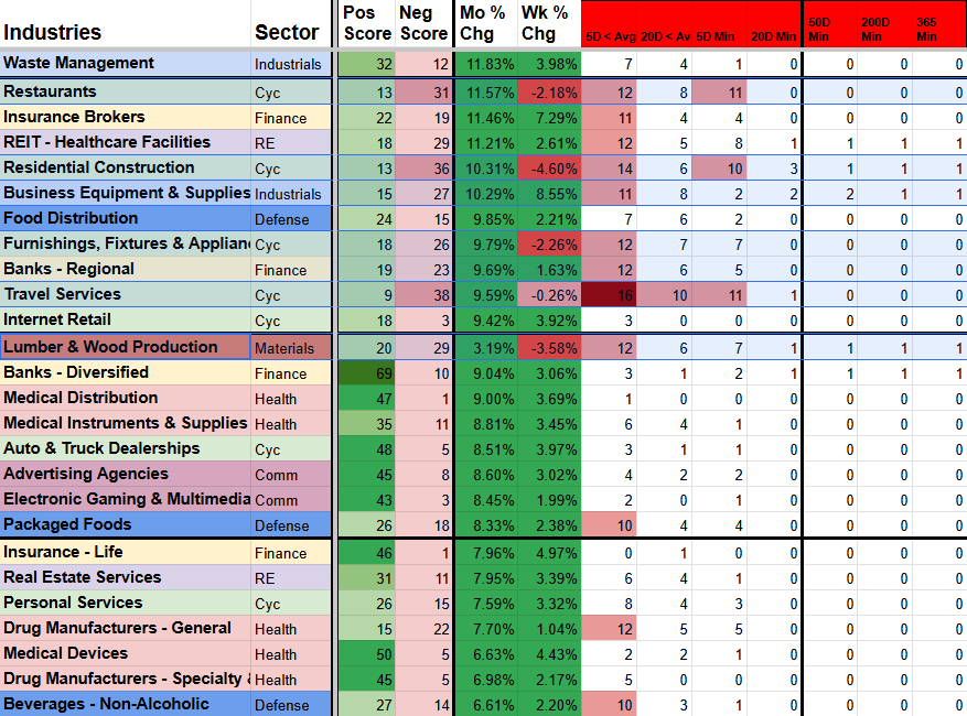
Sorted by highest Monthly % Change ↓ ↓ Spot the weakest Breadth ↓
Finding defensive or beaten-down
industries that are starting to turn
Scenario:
You want to find early signs of strength in out-of-favor or defensive sectors without chasing the obvious leaders everyone is already talking about. These setups can offer better risk/reward but are hard to spot because price action still looks dull.
How ISR Helps:
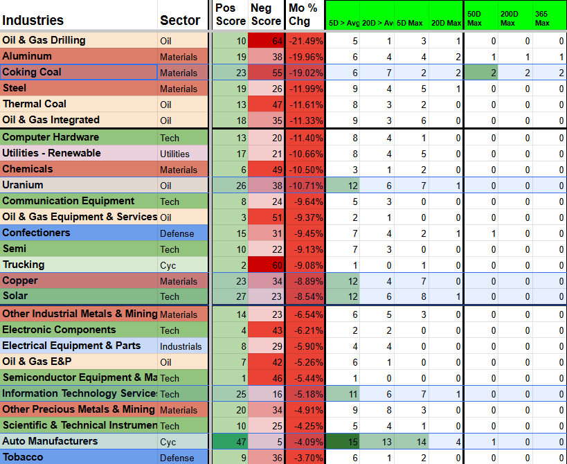
Filter for industries that are still ranked lower overall but showing improving Positive Strength Scores + new highs on the 50D and 200D timeframes. These are often the sectors where smart money is starting to accumulate quietly, before the crowd catches on.
Key benefit:
Surface the next rotation candidates while they’re still under the radar, instead of only seeing them after they’ve already started running.
Sort by lowest Monthly % Change ↓ ↓ Spot the Strongest Breadth ↓
Setup & Getting Started
Once you subscribe, you’ll receive an instant email with your personal copy of the Industry Strength Rankings template and simple setup instructions.
Getting started takes 2–3 minutes:
Make a copy of the template (one click).
Open the Rankings tab.
Click the Refresh Rankings button to load the latest scores.
Grant permissions when prompted (one-time step).
After the first refresh, your sheet will be fully populated with Positive and Negative Strength Scores, multi-timeframe relative strength, breakout alerts, and color-coded rankings across 100+ industries.
Need help? Just reply to the welcome email or contact admin@stockscore.systems.
FAQ
-
Scores and Counts are updated daily. Performance Percentage Changes and RS percentile Ranks are updated throughout the trading day.
-
No. Everything runs in Google Sheets with your own personal template. You only need a free Google account.
-
You’ll get an instant email with a link to make your own personal copy of the template plus setup instructions (2–3 minutes).
-
Watchlist Summary is stock-level. Industry Strength Rankings gives you the sector layer — Positive vs Negative momentum, breadth participation, and multi-timeframe breakout signals — so you can make smarter rotation decisions and focus only on the strongest industries.
-
Yes. Industry Strength Rankings is included in the Research and Pro bundles at a discounted price.
-
Reply to the welcome email or email admin@stockscore.systems. I handle setup support personally.
Turn Industry Noise Into Clear Rotation Signals
Stop Guessing Which Industries Are Actually Strong
Get clear Positive vs Negative Strength Scores, real participation data, and multi-timeframe breakout alerts in one sortable dashboard. Know exactly where the real money is rotating — and which sectors are quietly weakening — so you can focus only on the strongest industries before you pick stocks.
Used daily by active traders who want to stop chasing false breakouts and protect their gains with better industry context.