
Stock
Performance
Query
Quickly Answer “What Usually Happens Next?”
Type any stock ticker and instantly see how it has performed after similar historical setups across 25+ metrics and multiple timeframes. Get real statistical probabilities instead of guessing.
Turn historical precedent into a clear trading edge before you take the trade.

What You Get
Historical performance across daily, weekly, monthly, quarterly, and custom date ranges

Average return, best-case, and worst-case outcomes

Maximum Favorable Excursion (MFE) and Maximum Adverse Excursion (MAE)

Weighted averages that prioritize setups with larger sample sizes

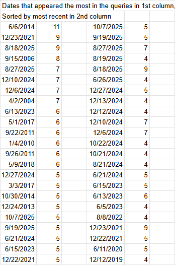
Frequent Dates analysis — shows which historical dates appeared most often

Win rates (% of time the stock closed green) for each timeframe

Clean, easy-to-read layout with 5 specialized Query sheets

How it Works
Most traders rely on recent price action or gut feel. Stock Performance Query gives you actual historical data — exactly how the stock has performed in the past when conditions were nearly identical to right now.
What the query shows you
Enter a ticker (example: AAPL). The tool automatically scans the stock’s entire history and finds every past instance that matches your current setup. It then tells you:
Win rate and average return for the next day, week, month, and quarter
How far the stock typically pulled back (risk) and how far it ran in your favor (reward)
Best-case and worst-case outcomes from similar setups
Weighted results that give more importance to periods with stronger sample sizes
Bottom line:
Instead of guessing whether a setup is good, you get instant, data-backed statistical evidence. The Stock Performance Query turns historical precedent into a real trading edge — helping you validate ideas, manage risk better, and make higher-probability decisions with confidence.
Best used with: Watchlist Summary + Industry Strength Rankings for maximum edge.
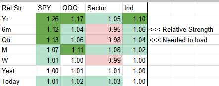
Relative Strength Snapshot This small table gives you a quick view of the stock’s Relative Strength compared to SPY, QQQ, its Sector, and its Industry across multiple timeframes (Year, 6 months, Quarter, Month, Week, Yesterday, and Today). It’s a fast way to see whether the stock is showing strength or weakness versus the broader market and its peers right now.
Enter any Ticker
↓
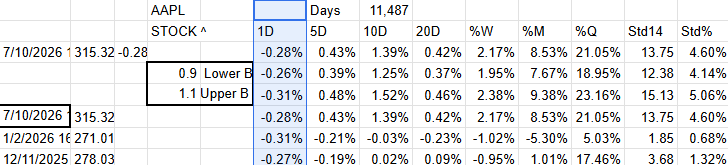
Search and Find matching historical instances over 25+ metrics and time frames
↓

Delivers clear statistical outcomes
Additional Insights Provided
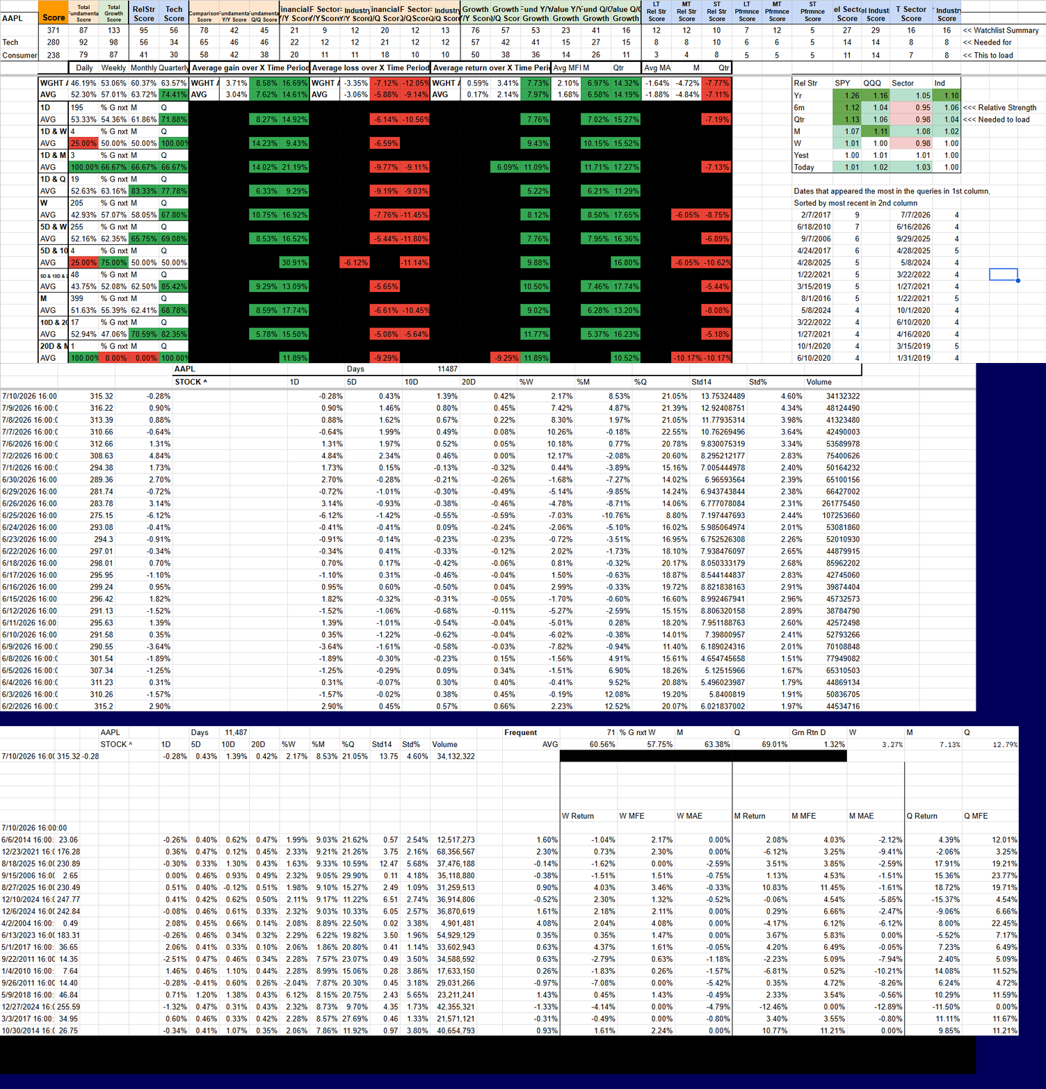
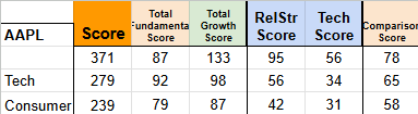
Stock Score Snapshot (from Watchlist Summary) At the top of the results, you’ll see the stock’s current scores pulled directly from the Watchlist Summary. This includes the Total Score along with breakdowns for Fundamentals, Growth, Relative Strength, Technicals, and Comparison Score. Directly below it, you’ll also see the average scores for the stock’s Sector and Industry. This gives you an instant comparison so you can see whether the stock is stronger or weaker than its peers.

Frequent Query Results. This section shows performance data from the dates that appeared most frequently across your queries. On the right side, you’ll see a list of the most common historical dates that matched your current setup (for example: 6/6/2014, 12/23/2021, etc.). The table on the left displays the average results from queries run on those frequent dates, giving you another angle on how the stock has typically performed when conditions were similar.

Most Frequent Dates On the far right, you’ll see a list of the specific dates that appeared most often when running queries. These dates are sorted by most recent. This helps you quickly understand which historical periods are showing up most frequently as similar setups to the one you’re looking at today.
Why These Extras Matter
These four sections are designed to give you more context without having to switch between tools. You can quickly see:
How the stock currently scores compared to its sector and industry
Which historical dates keep coming up as similar
How the stock’s relative strength looks across different timeframes
Performance data specifically from the most common matching periods
Together, they help you validate your setup from multiple angles before making a decision.
Real Edge in Action: How Traders Use Stock Performance Query
Real Trading Scenarios. Real Decisions.
Validating a setup
before entering
Scenario:
You’ve spotted what looks like a strong technical setup. Before risking capital, you want to know whether this type of move has historically been a winner.
How SPQ Helps:
Enter the ticker and run the query. Then follow these steps to read the results:
Look at the overall Win Rate (first big number) — This tells you how often the stock closed higher after similar setups.
Check Avg Return across the timeframes you care about (Daily / Weekly / Monthly / Quarterly).
Review Avg MFE and Avg MAE — These show your typical reward potential vs risk (how far it usually runs in your favor vs against you).
Focus on the rows with the highest sample sizes (they’re weighted more heavily).
High win rate + strong average returns + solid MFE = higher conviction to take the trade with normal or larger size.
Key benefit:
Enter trades with real historical precedent instead of hoping the pattern works this time.
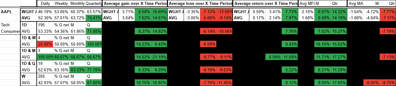
Metrics ↓ Win Rate ↓ Avg Gain ↓ Avg Loss ↓ Avg Return ↓ Avg MFE ↓ Avg MAE ↓
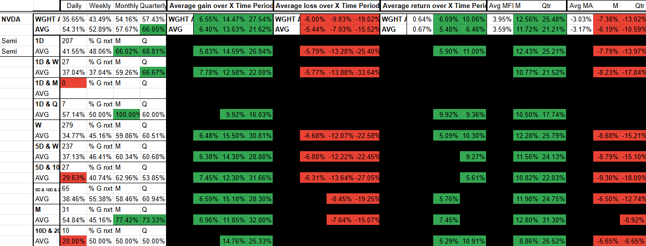
When NVDA had the same Month% move as today, it closed higher 77% of the time 1 month later and 73% of the time 3 months later (across 31 similar instances). The average gain on the month was 11.85%, with an average MFE of 12.8%. Its average return across all 31 instances was 7.45%.
→
Avoiding setups that
have historically failed
Scenario:
A stock is showing a pattern that looks familiar, but you’re unsure whether this type of move has usually worked out in the past.
How SPQ Helps: Enter the ticker and run the query. Then follow these steps:
Look at the overall Win Rate first — if it’s low (especially below 45–50%), the setup has historically been a loser more often than not.
Check Avg Return and Avg Loss across your target timeframes.
Pay close attention to Avg MAE — this shows how far the stock typically moves against you before (or if) it recovers.
Focus on rows with decent sample sizes for more reliable data.
If most similar setups show low win rates and large average losses, you now have clear data to stay away or significantly reduce position size.
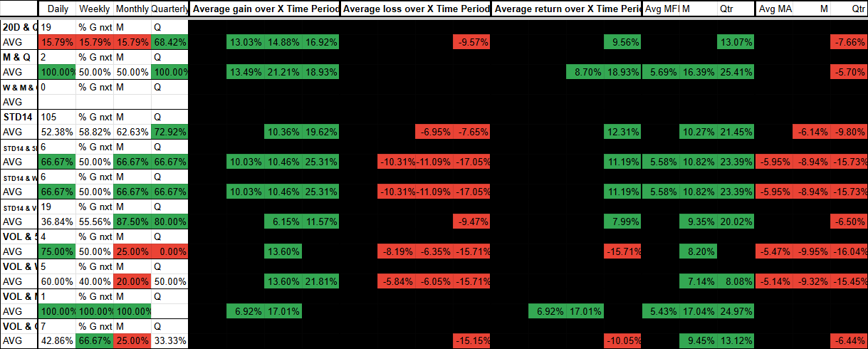
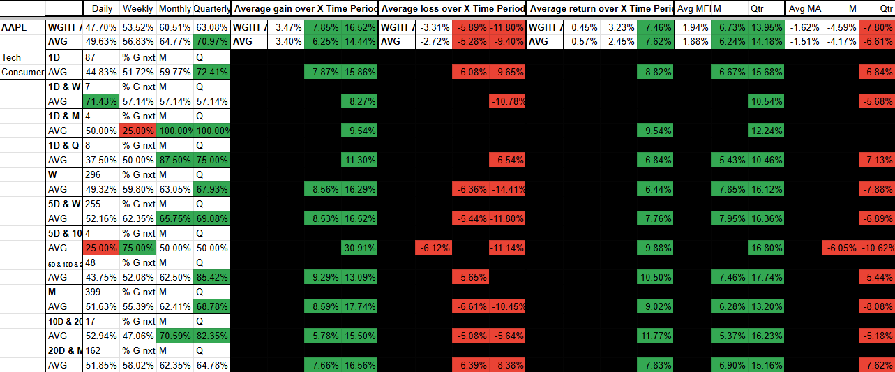
When NVDA had a similar setup, the row with 19 matching instances (20D & Q) showed only a 15.79% win rate across daily, weekly, and monthly timeframes. The blacked-out sections indicate that the average return less than 0% but not worse than -5% in those periods, meaning the historical outcome was not meaningful.
Sizing positions with
real statistical edge
Scenario:
You like the setup on a stock, but you want to know how aggressive you should be. You’d rather base your position size on actual historical data instead of using the same size on every trade.
How SPQ Helps:
Start with the overall Win Rate and Avg Return.
Compare Avg MFE (how far the stock typically runs in your favor) against Avg MAE (how far it moves against you).
Look at the consistency of results across multiple timeframes.
Give more weight to rows with larger sample sizes, as they are more statistically reliable.
Strong win rate + high average MFE with manageable MAE across decent sample sizes = higher conviction to size up. Weak or inconsistent results = size down or skip the trade.
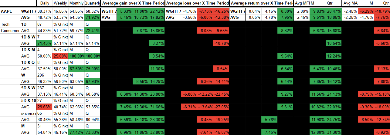
Note how AAPL has on average twice the size MFE ↓ than it does MAE ↓
Combining historical precedent
with current market
and industry context
Scenario:
You’ve found a stock and industry that look strong using your other tools, but you want to confirm whether this specific setup has historically performed well in similar overall market conditions.
How SPQ Helps: Enter the ticker and run the query. Then follow these steps:
Review the overall Win Rate and Avg Return first.
Look across different timeframes and compare results when the broader market was in a similar state (bullish, range-bound, high volatility, etc.).
Check Avg MFE and Avg MAE to understand typical reward and risk in those conditions.
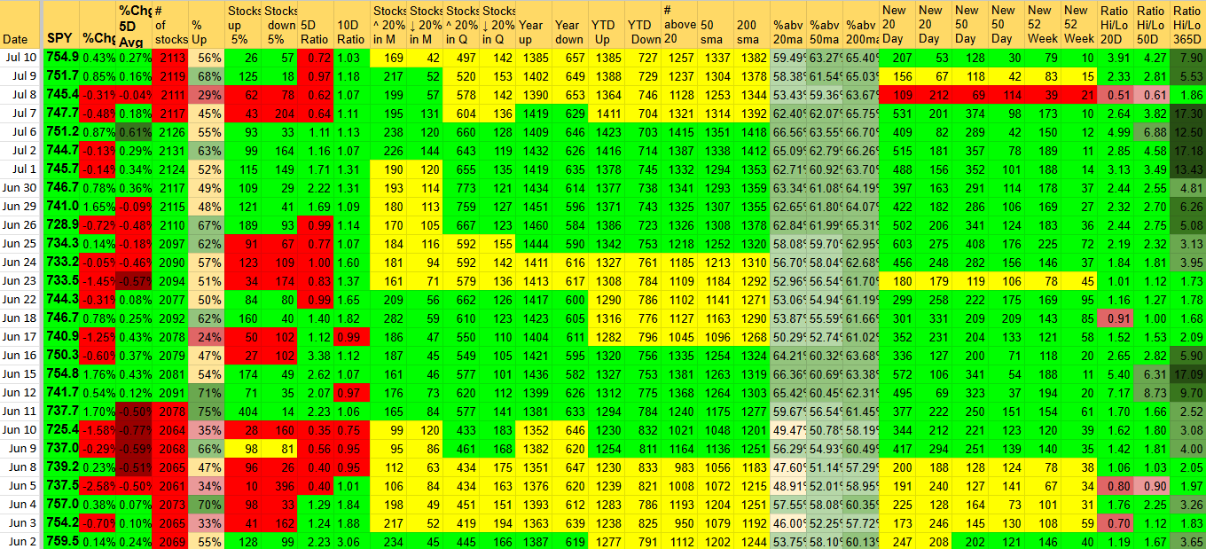
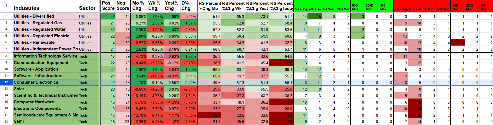
Cross-reference with Market Sentiment Dashboard and Industry Strength Rankings to see if the current environment matches the periods where similar setups worked best.
When historical performance is strong in market conditions similar to today, you have higher conviction to act. When similar setups struggled in comparable environments, you can reduce size or wait for better conditions.
Setup & Getting Started
Once you subscribe, you’ll receive an instant email with your personal copies of the Stock Performance Query template and all supporting Query files, plus simple setup instructions.
Getting started takes 4–5 minutes:
Make a Copy of the Main Template and all 5 Query files using the links in your welcome email.
Open your new Stock Performance Query copy.
Go to the top menu → StockScore Query → 🚀 First-Time Setup - All 5 Queries.
When prompted, paste the full URLs of your newly made copies exactly as asked.
Click OK on every pop-up that appears (there will be several).
After setup finishes, click into each Query Sheet tab (Q1 through Q5) and approve the IMPORTRANGE permissions when Google prompts you. The Dates tab inside Query 5 will also need approval.
Daily Use:
Click Refresh Query for normal daily updates.
Use Force Recalc - All Queries (Aggressive) only if data ever looks stale.
Important Notes:
The tool automatically checks your active subscription status every time the sheet is opened or edited.
First-Time Setup works best on completely untouched copies.
If you delete anything or run into issues, the fastest fix is to delete your copies and start fresh with new ones from the welcome email.
FAQ
-
Historical data is available at all times. New analogs and performance results update as fresh market data becomes available.
-
No. Everything runs in Google Sheets with your own personal template. You only need a free Google account.
-
You’ll get an instant email with a link to make your own personal copies of the template plus setup instructions (2–3 minutes).
-
Watchlist Summary, Industry Strength Rankings, and Industry Performance Rankings show current data. Stock Performance Query gives you historical precedent — how stocks have actually performed in nearly identical past setups.
-
Yes. Stock Performance Query is included in the Research and Pro bundles at a discounted price.
-
Just reply to the welcome email or contact admin@stockscore.systems. I personally help users get set up quickly if they run into any issues.
Stop Guessing on Setups — See the Historical Precedent
Query any stock and instantly see how it has performed in nearly identical past setups. Know the real edge (or lack of edge) before you take the trade.
Used daily by active traders who want data-backed conviction instead of hope.