

Market
Sentiment
Dashboard
See When the Market Shifts
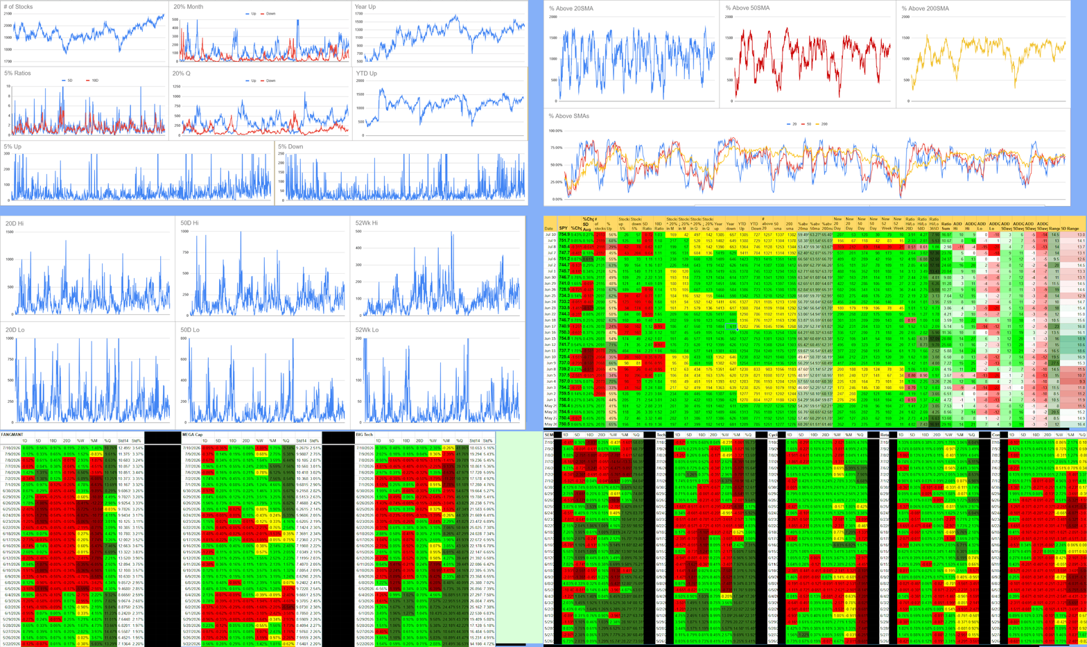
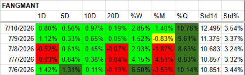
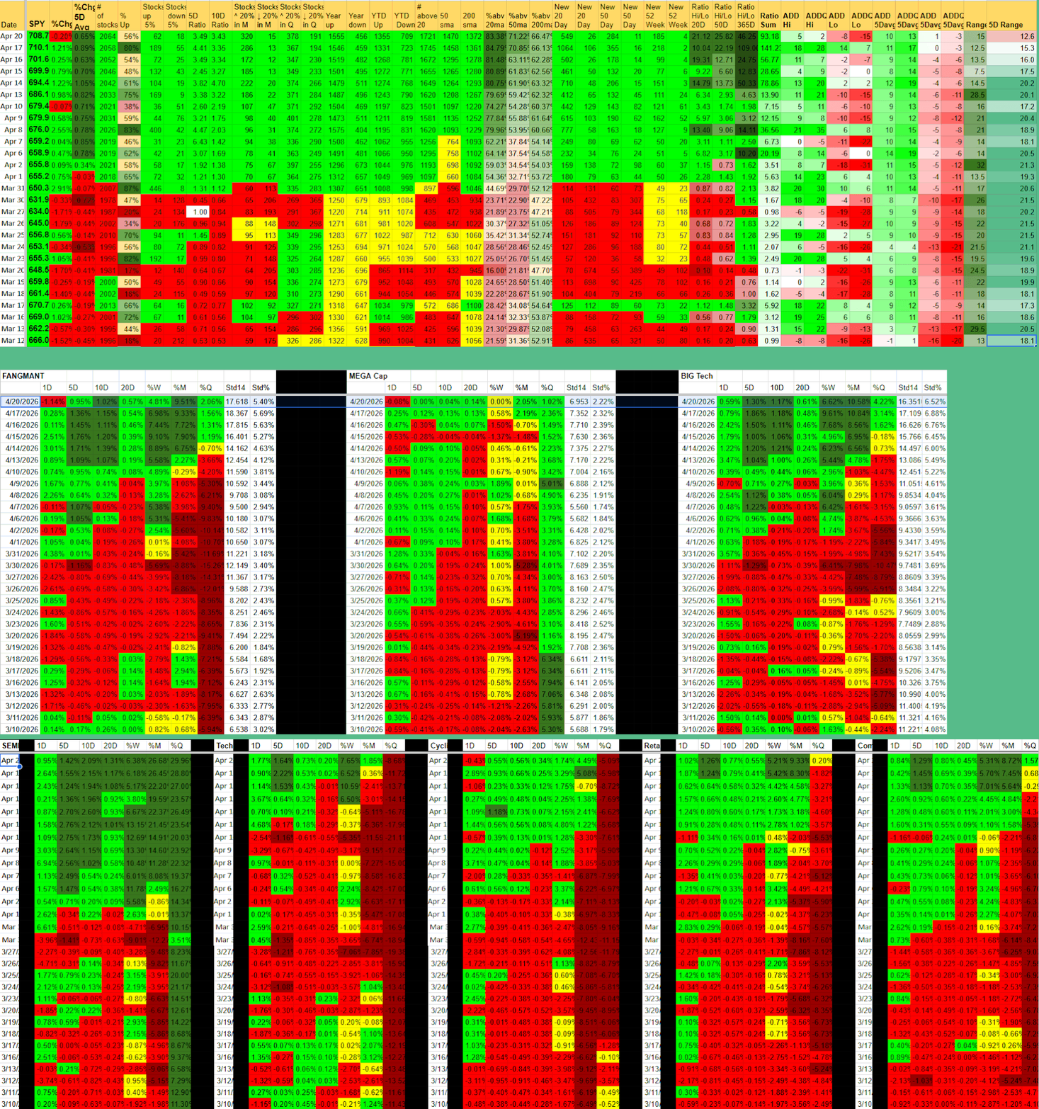
Daily high-level view of market breadth, leadership, and participation — plus detailed performance tracking of key sector groups (FANGMANT, Mega Cap, Big Tech, Offense, Cyclical, Defensive, and more).
See whether the market has real support behind the move or if leadership is narrow and fragile. One clean dashboard.

What You Get
One clean dashboard with daily market sentiment and breadth updates

High-level view of overall market participation and leadership
Detailed performance tracking of major sector groups (FANGMANT, Mega Cap, Big Tech, Offense, Cyclical, Defensive, etc.)

One-click refresh keeps everything current. Combines big-picture sentiment with sector-level detail to give you complete market context.

Multi-timeframe readings (1D, 5D, 10D, 20D, weekly, monthly, quarterly)

Clear color-coded performance and sentiment signals

Fully sortable with export and personal templates

How Market Sentiment Dashboard Works
Most traders look only at price action or a single index and miss the important underlying signals — whether the market move has broad participation or if it’s being carried by a narrow group of sectors.
What the dashboard measures:
The tool tracks both overall market sentiment and detailed performance across key sector groups. It shows breadth (how many stocks/sectors are participating), leadership concentration, and performance across multiple timeframes with clear color coding.
Key signals it surfaces:
Overall market breadth and participation levels
Which sector groups are leading or lagging (Offense, Cyclical, Defensive, FANGMANT, Mega Cap, Big Tech, etc.)
Momentum shifts in sector group performance
High-level bullish vs bearish sentiment context
Whether recent market moves are supported by broad strength or narrow leadership
Fully sortable with color coding for instant visual clarity. One-click refresh. Designed to work alongside Watchlist Summary, Industry Strength Rankings, and Industry Performance Rankings so you can see the full picture from market level down to individual stocks.
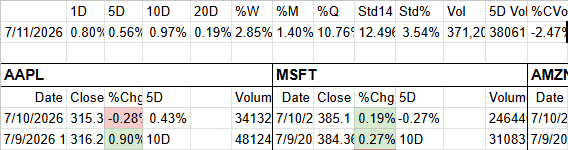
Market and Sector Group Data
↓
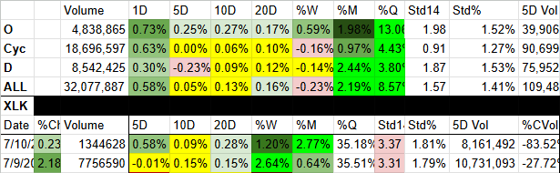
Sentiment and Performance Engine
↓
Market Sentiment Dashboard
Real Edge in Action: How Traders Use Market Sentiment Dashboard
Real Trading Scenarios. Real Decisions.
Gauging whether a
market rally has support
Scenario:
The market is moving higher, but you’re not sure if the advance is broad-based or being carried by just a few sectors or names.
How MSD Helps:
Check the overall breadth and participation readings along with sector group performance (Offense, Cyclical, Defensive, etc.). Strong breadth and multiple sector groups showing green = real support. Narrow leadership with mostly red sector groups = higher risk of reversal.
Key benefit:
Avoid getting caught in fragile rallies by seeing whether the market move has genuine participation behind it.
Spotting when market
leadership is narrowing
Scenario:
The market has been trending higher, but you suspect strength is becoming concentrated in fewer sectors. You want an early warning before a potential pullback.
How MSD Helps:
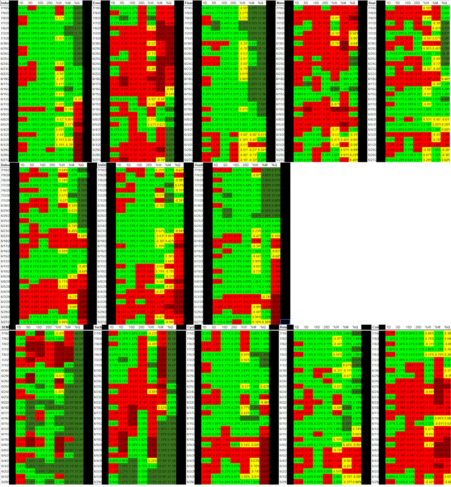
Monitor leadership concentration and sector group performance. When fewer sector groups are driving the market and breadth starts to decline, it’s often a signal to reduce risk or prepare for volatility.
Key benefit:
Get early warning when market risk is rising so you can protect gains instead of riding a narrowing advance too far.
Identifying strong market environments
for aggressive positioning
Scenario:
You want to be more aggressive when the market has broad support and reduce exposure when it doesn’t.
How MSD Helps:
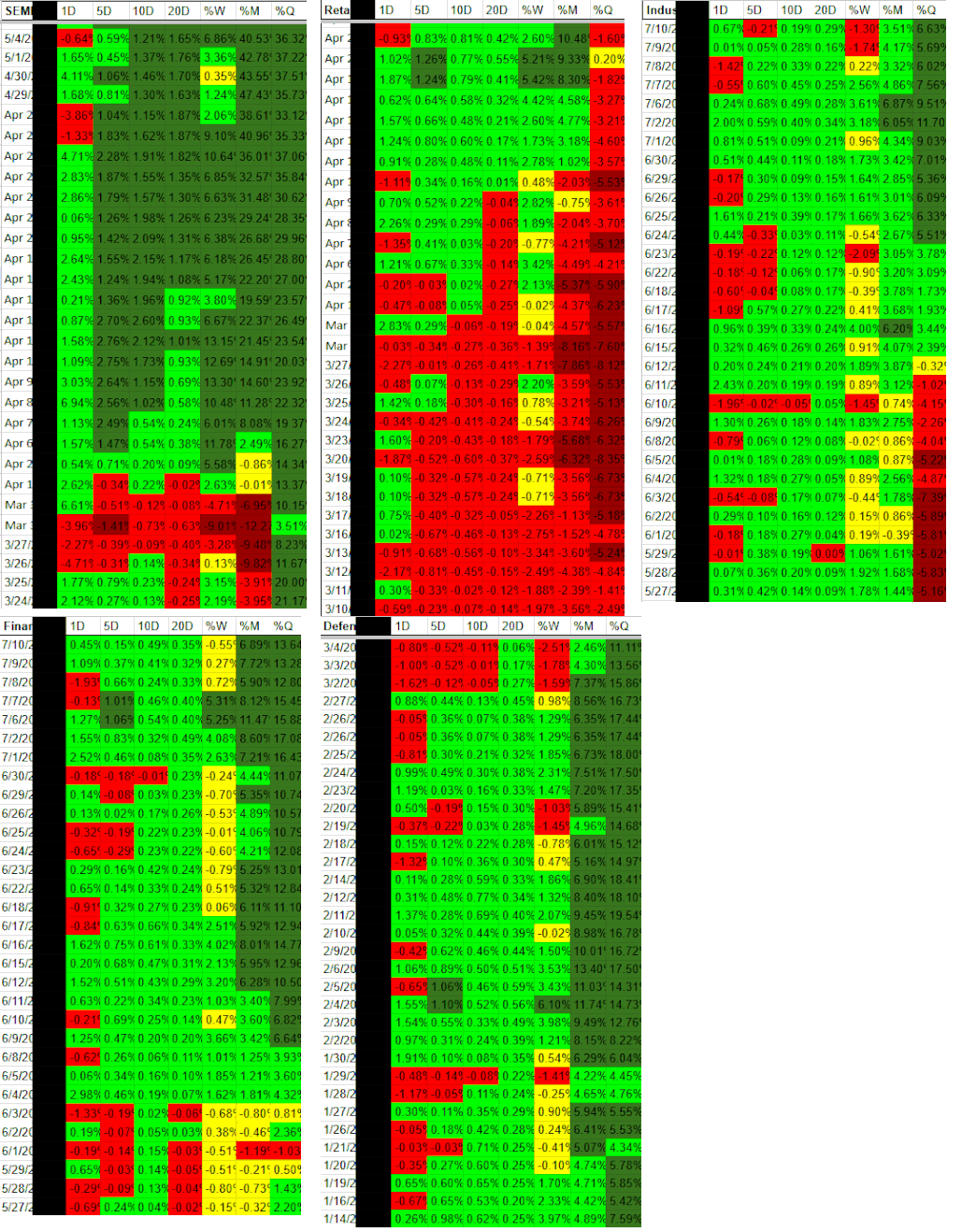
Look for periods where overall breadth is strong and multiple sector groups (Offense, Cyclical, etc.) are showing green performance. These are typically better environments for taking more risk and being fully invested.
Key benefit:
Align your risk level and positioning with actual market conditions instead of guessing based on price action alone.
Setup & Getting Started
Once you subscribe, you’ll receive an instant email with your personal copy of the Market Sentiment Dashboard template and simple setup instructions.
Getting started takes 2–3 minutes:
Make a copy of the template (one click).
Open the Dashboard tab.
Click the Refresh Data button to load the latest sentiment readings.
Grant permissions when prompted (one-time step).
After the first refresh, your sheet will be fully populated with daily market breadth, leadership, and participation metrics.
Need help? Just reply to the welcome email or contact admin@stockscore.systems.
FAQ
-
Market sentiment and breadth data update daily. The one-click refresh pulls the latest readings.
-
No. Everything runs in Google Sheets with your own personal template. You only need a free Google account.
-
You’ll get an instant email with a link to make your own personal copy of the template plus setup instructions (2–3 minutes).
-
This gives you the high-level market view (breadth and sentiment). Industry Strength Rankings and Industry Performance Rankings give you sector-level detail, while Watchlist Summary is stock-level. Many traders use all of them together.
-
Yes. Market Sentiment Dashboard is included in the Research and Pro bundles at a discounted price.
-
Just reply to the welcome email or contact admin@stockscore.systems. I personally help users get set up quickly if they run into any issues.
Stop Trading Blind to Market Sentiment
Get the full picture of market breadth, leadership, and sector group performance in one dashboard. Know when the market has real support and when leadership is narrow and fragile.
Used daily by active traders who want better context for timing, risk, and rotation decisions.