
Watchlist
Performance &
Relative Strength
Track How Your Stocks Are Performing Relative to the Market
See real-time performance and relative strength for your entire watchlist in one clean dashboard. Compare against the market, sectors, and peers instantly.
Know which of your stocks are truly leading and which are lagging so you can make faster, smarter portfolio decisions.

What You Get
Real-time performance tracking for the entire watchlist
Multi-timeframe performance (daily, weekly, monthly, quarterly, YTD)
Built-in sector and industry peer comparisons

One-click refresh keeps everything current. Designed to work seamlessly with Watchlist Summary, Industry Strength Rankings

Relative strength vs SPY, QQQ, sector, and industry

Clear color-coded rankings and alerts for leaders and laggards

Export your watchlist + save personal templates

How Watchlist Performance & Relative Strength Pack Works
Most traders look at individual stock charts and miss the important context — how each stock is performing relative to the broader market, its sector, and its peers.
What the tool measures:
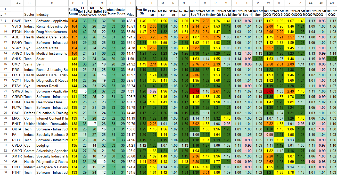
This is a more narrowed, zoomed-in view focused on technicals and relative strength. The tool tracks every stock in the watchlist and calculates performance and relative strength across multiple timeframes. It shows how each stock is doing versus SPY, QQQ, its sector, and its industry.
Key signals it surfaces:
Top and bottom performers in your watchlist on technical and relative strength metrics
RS Percentile Rankings on all Stocks on all Time Frames
Momentum shifts (which stocks are gaining or losing ground technically)
Clear comparison to the market and peers on relative strength
Shows when a stock is trading at or near a Daily or Weekly 9/20/50 Moving Average
Fully sortable with color coding for instant visual clarity. One-click refresh keeps everything current. Includes an Add-ons section sheet for extra analysis and custom views. Built to give you a fast, focused technical view of your watchlist’s true strength so you can focus on what’s working and cut what isn’t.

Watchlist Data
↓

Performance and relative strength engine
↓

Clear rankings and comparisons dashboard
Real Edge in Action: How Traders Use
Real Trading Scenarios. Real Decisions.
Watchlist Performance & Relative Strength Pack
Identifying the strongest
stocks in your watchlist
Scenario:
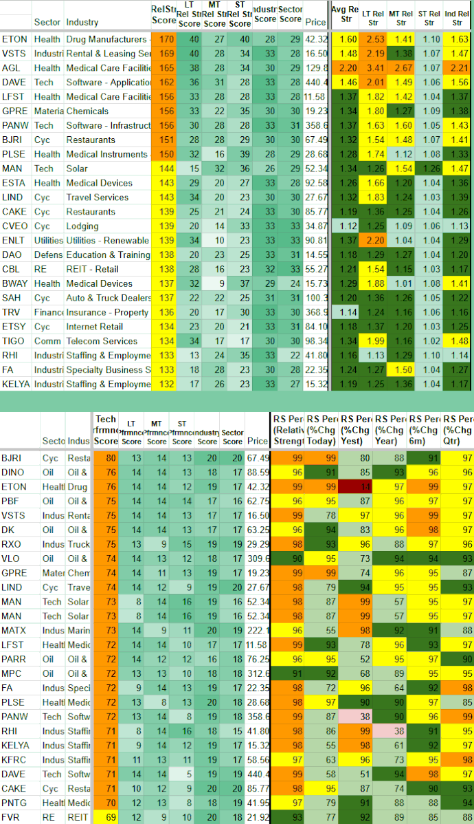
You have a list of stocks you’re watching, but you want to know which ones are truly leading on technicals and relative strength right now.
How the Watchlist Pack Helps:
Sort the dashboard by Relative Strength or recent performance. The top-ranked stocks are showing the strongest technical momentum and outperforming the market, sector, and peers. Focus your attention and capital on these names first.
Key Benefit:
Quickly identify the best technical performers instead of treating every stock in your watchlist equally.
Spotting weakening stocks
before they drag down your portfolio
Scenario:
Some stocks in your watchlist are starting to lose technical strength. You want to catch this early so you can reduce exposure before the weakness becomes obvious on the chart.
How the Watchlist Pack Helps:
Sort or filter the dashboard by Relative Strength metrics. Then follow these steps:
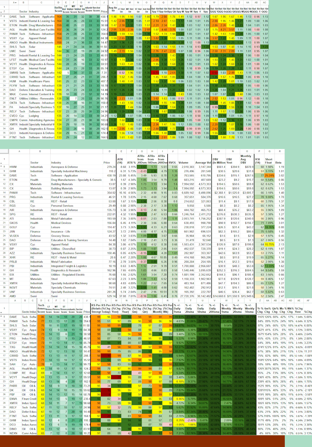
Look at RS Percentile across multiple timeframes (especially Month, Quarter, and 6m). A sharp drop in percentile rank (e.g., falling from top 20% to bottom 30%) is an early warning sign.
Check the % +/- from key SMAs (20sma, 50sma, 200sma). Stocks that have been stretched far below their moving averages for an extended period often show continued weakness.
Watch for stocks that are no longer coiling near their SMAs and are instead breaking lower with increasing distance from the averages.
Key Benefit:
Catch technical deterioration early by combining relative strength ranking with moving average distance instead of waiting for price to break down.
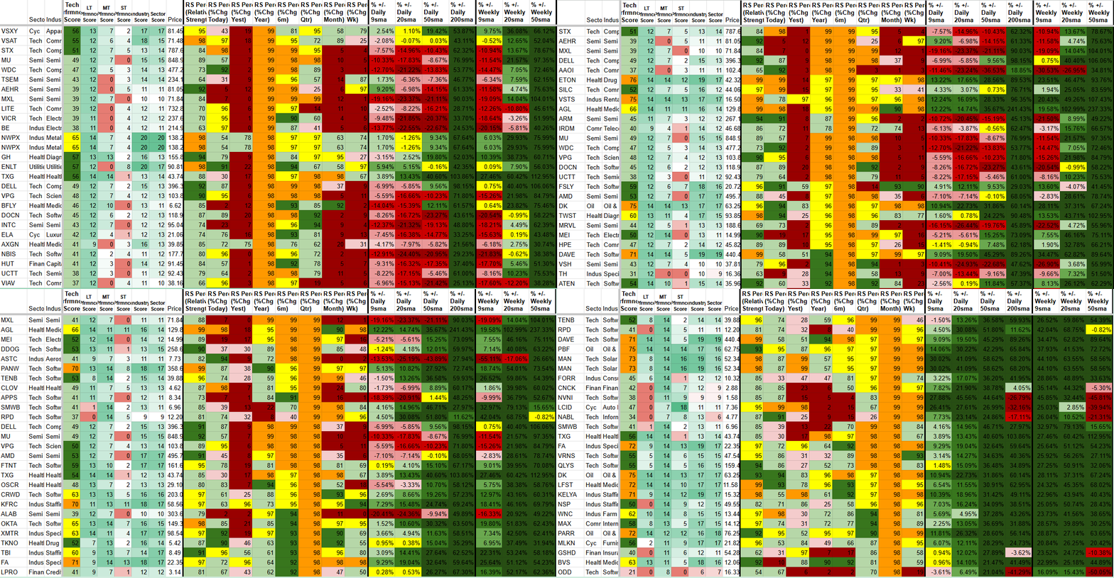
Red is bad. Note the negative SMA numbers and negative shorter time frame RS Percentile numbers. These are stocks that have been very strong on a higher time frame but are now seeing a significant drawdown on a shorter timeframe. Sync this with Industry Strength Rankings and spot which stocks are next in weak industries.
Deciding which stocks to
add, keep, or remove
Scenario:
You’re reviewing or cleaning up your watchlist and want to make data-driven decisions based on technical strength.
How the Watchlist Pack Helps:
Run your current and potential stocks through the tool. Then:
Check RS Percentile rankings across multiple timeframes. Stocks consistently in the top 20–30% on RS Percentile (especially on Month and Quarter) are showing strong relative outperformance.
Look at SMA distance. Stocks that are coiling tightly around their 20sma or 50sma for an extended period while maintaining high RS Percentile often have explosive potential when they break out.
Compare both metrics together. A stock with high RS Percentile but stretched far above its SMAs may be extended, while one coiling near its averages with rising RS Percentile can be a high-probability addition.
Key Benefit:
Build and maintain a higher-quality watchlist by focusing on stocks showing both strong relative strength ranking and healthy technical signals.
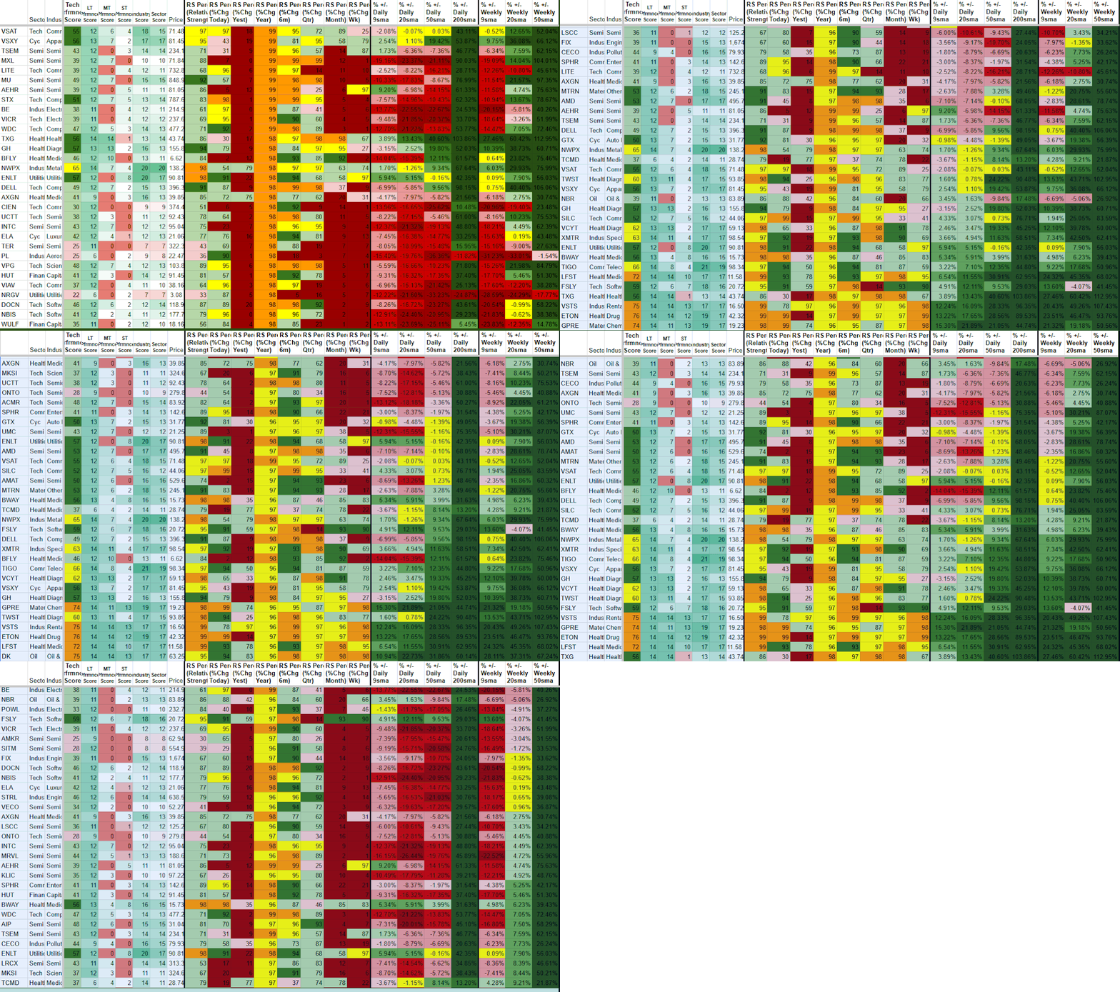
Use strongest RS Percentiles and sort by the different SMAs ↓ ↓ ↓ ↓
Combine stocks that appear in multiple sorts with leading industries for highest potential
Managing risk and allocation
Scenario:
You want to know which parts of your portfolio are working technically and which are not, so you can adjust sizing and risk accordingly.
How the Watchlist Pack Helps:
Review the overall watchlist rankings. Then:
Prioritize stocks with high RS Percentile across multiple timeframes — these are your technical leaders.
Look for stocks that are coiling near their SMAs (small % distance) while maintaining strong RS Percentile. These often offer the best risk/reward for larger positions.
Reduce exposure to stocks showing declining RS Percentile combined with increasing distance below key moving averages (loss of technical support).
Use the Add-ons section sheet for deeper custom views when you want to analyze specific groups or timeframes in more detail.
Key Benefit:
Manage risk and allocation based on current technical strength and relative strength ranking instead of equal sizing or emotional decisions.
using technical relative strength
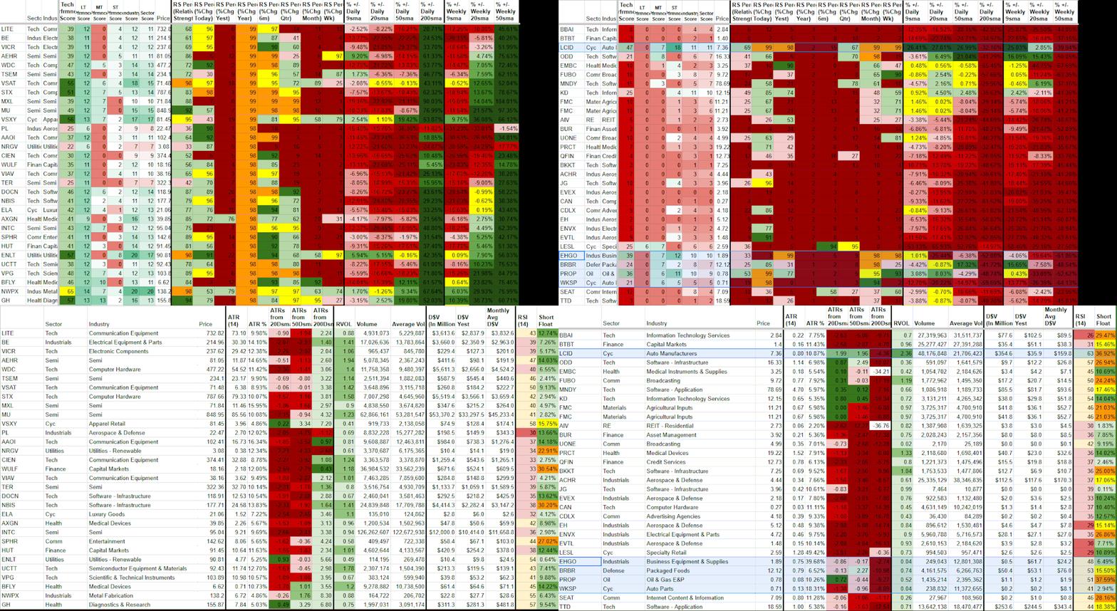
Spot the best performing stocks at the bottom, and the worst performing ones at the top. Combine with Watchlist Summary for Fundamentals, and industry strength for the best chance for winners.
Setup & Getting Started
Once you subscribe, you’ll receive an instant email with your personal copy of the Watchlist Performance & Relative Strength Pack template and simple setup instructions.
Getting started takes 2–3 minutes:
Make a copy of the template (one click).
Open the Dashboard tab.
Click the Refresh Data button to load your watchlist and latest performance metrics.
Grant permissions when prompted (one-time step).
After the first refresh, your sheet will be fully populated with performance and relative strength data for your watchlist.
Need help? Just reply to the welcome email or contact admin@stockscore.systems.
FAQ
-
Performance and relative strength data are real time. Update with one-click refresh.
-
No. Everything runs in Google Sheets with your own personal template. You only need a free Google account.
-
You’ll get an instant email with a link to make your own personal copy of the template plus setup instructions (2–3 minutes).
-
Watchlist Summary shows current scores. This tool focuses on performance and relative strength tracking for your entire watchlist over time.
-
Yes. Watchlist Performance & Relative Strength Pack is included in the Research and Pro bundles at a discounted price.
-
Just reply to the welcome email or contact admin@stockscore.systems. I personally help users get set up quickly if they run into any issues.
Stop Flying Blind on Your Watchlist
See which of your stocks are truly leading and which are lagging with clear performance and relative strength data. Make faster, smarter portfolio decisions.
Used daily by active traders who want to focus on strength and cut weakness.